Our 1903 farmhouse is getting a new kitchen to fit the heritage of the home. It’s a dream I’ve been working on for several years and I’m excited to finally be seeing all the pieces come together.
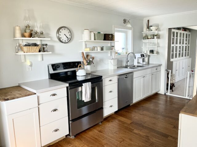
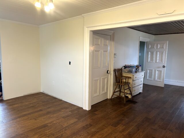
I recently shared the Kitchen Before Pictures of what had been in place for most of the last 10 years. While I didn’t mind the white kitchen look, it was always a half-finished room of mismatched pieces. I cannot wait to have a cohesive kitchen aesthetic this time around.
After years of working on the kitchen design and aesthetic, it has been so exciting to start to pull all the pieces together. I’m lucky to have a good friend in the industry to help me reign in all my whirling ideas – Renee Frostick of the award-winning interior design firm Two Birds Design. If you’re taking on a project like this, I highly recommend consulting with a professional. It was incredibly helpful to have fresh eyes on the project from someone with experience.
The goal is to create a warm and inviting space that is the heart of the home, while still dealing with our two biggest pain points. Lack of counter space and limited storage has been a big part of our frustration in this space.
English Country Kitchen Inspiration
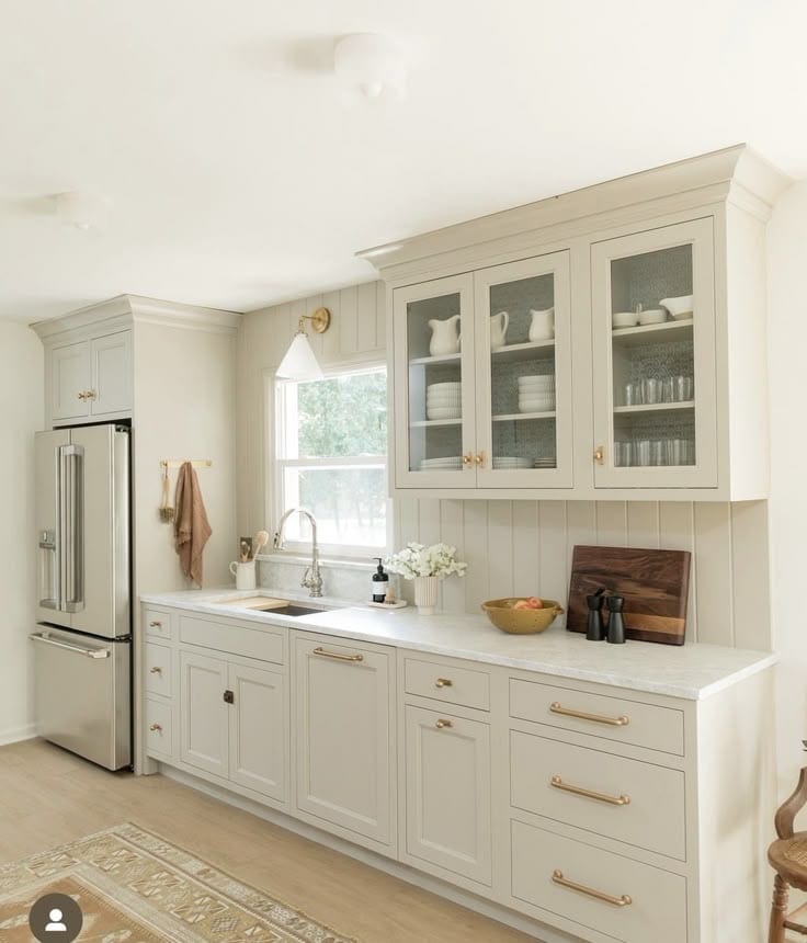
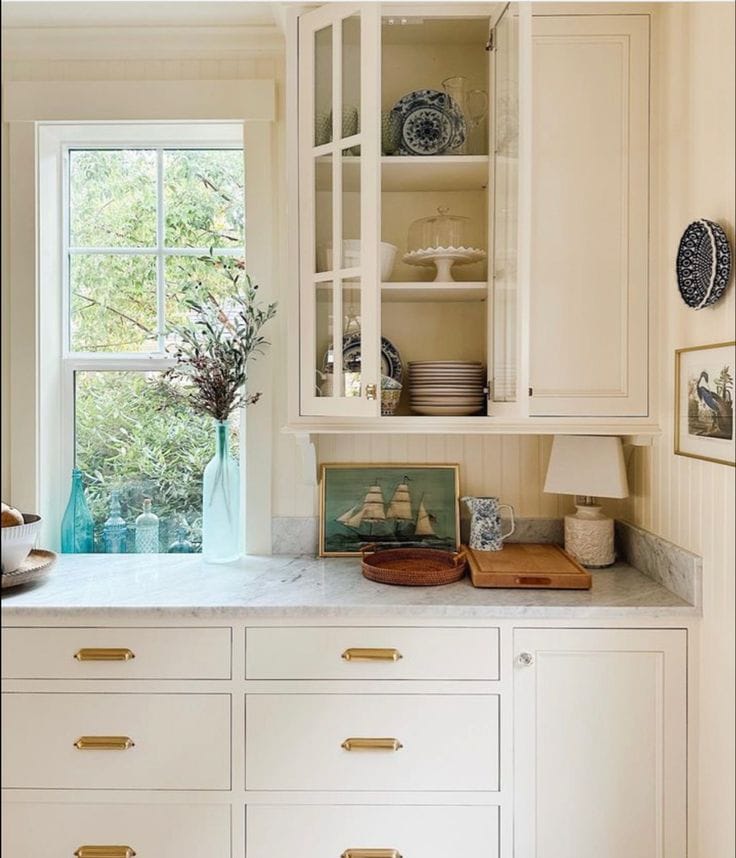
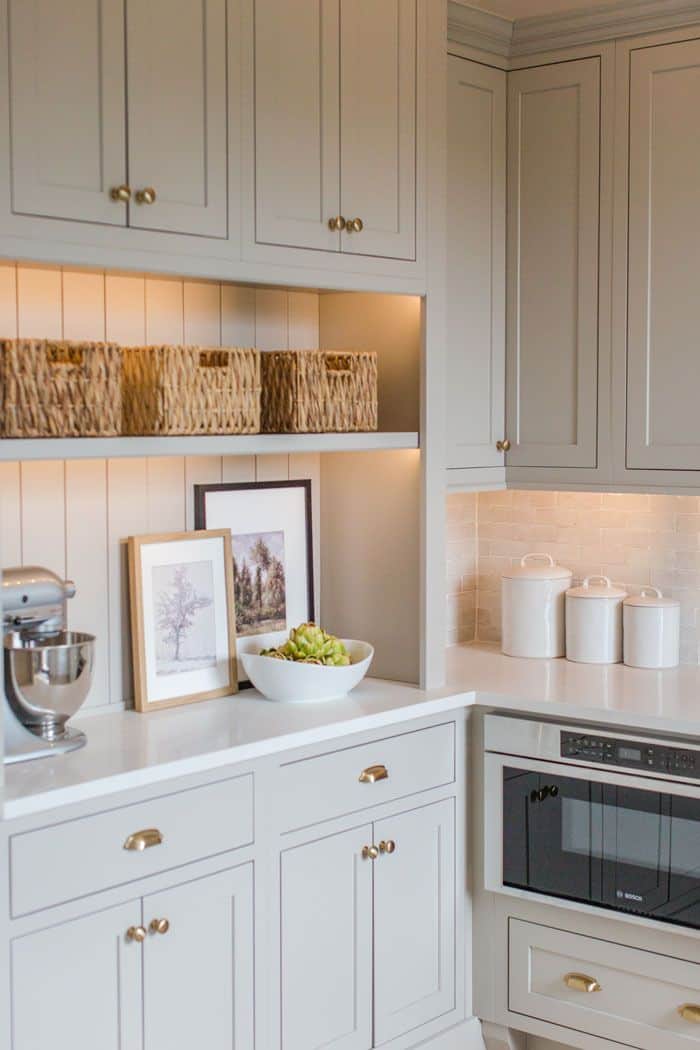
I’ve been drawing inspiration from the classic aesthetic of English country homes. The focus was on warmth and timeless elements, while still having modern function.
I’ve saved some of my favourite Country Kitchen Inspiration on Pinterest. Many of them are for inset kitchen cabinets (where the fronts are flush with the frame). We have opted for overlay cabinets that achieve a similar look without the added cost.
Kitchen Design Choices
Having never renovated a kitchen before, I was surprised by just how many decisions you have to make and how to get them to all come together for a cohesive look. We started with paint colours and countertops and then worked from there.
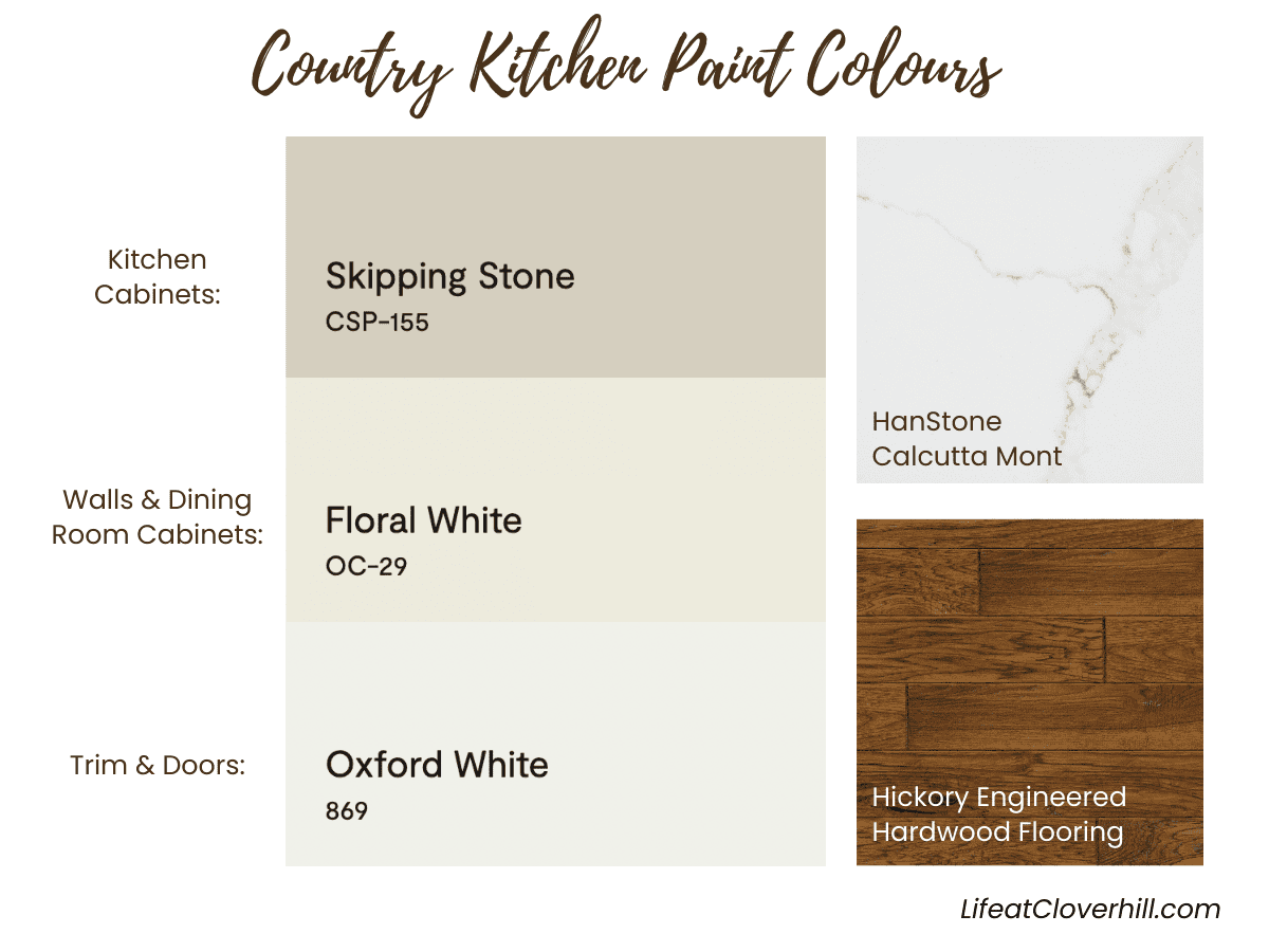
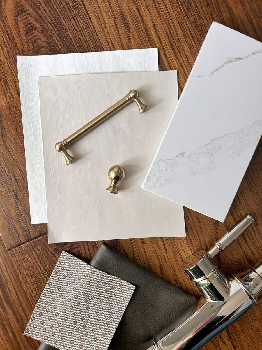
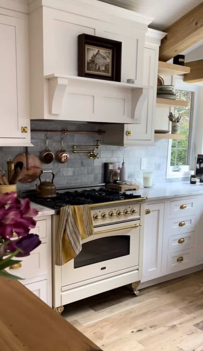
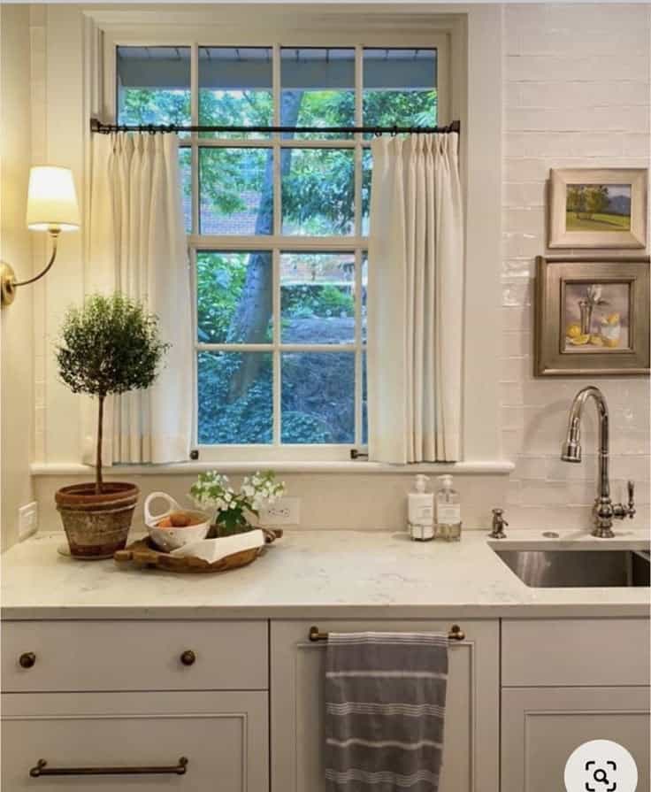
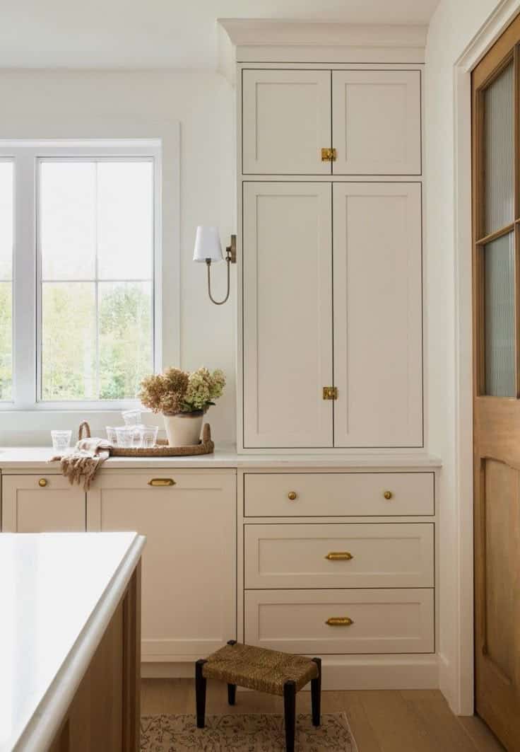
I’ve chosen warm neutrals from Benjamin Moore for the cabinets and walls. Skipping Stone for the kitchen cabinets and Floral White for the walls and dining room cabinets. Our existing trim colour throughout the house is Oxford White (you can see it in our Front Entry Reveal).
After going back and forth on the countertops (there is just so much to choose from!), I settled on Calcutta Mont by Canadian brand HanStone. It had a nice greige vein through it that goes well with the warmer neutral paint colours. I picked an ogee edge to tie in nicely with the original 1903 wood trim throughout the house.
We’re keeping our hickory engineered hardwood floors that we had installed five years ago. We have them in the dining room, kitchen and front entry, and they’ve held up very well.
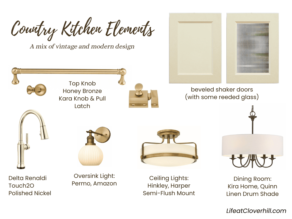
Pulling together all the finer details has been fun too. It’s a mix of traditional brass elements with a few modern touches. The reed glass was a great recommendation from my designer friend, as I would have probably gone with clear and had everything on display. The reed glass will really help hide things in the cupboards a bit, while still letting in light.
Hardware – This is one area I spent quite a bit of time looking into because you touch your handles and knobs many times every day. You want them to look and feel good. I found a great hardware dealer, Handle This, who helped me find classic pieces that worked well in our space and our budget. I went with the Kara knobs and Kara pulls from Top Knobs and added a latch for one special cabinet. They’re all in the Honey Bronze that is the perfect warm brass colour with a smooth finish.
Faucet – We’ve had a Delta touch faucet for 10 years and have loved it. This was one of the few requests that my husband had with the kitchen design…he wanted a touch faucet again. We’ve gone with the same Delta Touch2O technology but in the newer Renaldi profile in Polished Nickel. (Canada Link / US Link)
Lighting – Our current kitchen lighting has always felt too dark, so we hoped to add more fixtures, but there were some limitations with our original 1903 ceiling. The solution was to add better, brighter light fixtures to bring some much-needed light into the space. I’ve always loved the softer look of milk glass, so I focused on pieces that had that element to them.
Over the sink, we’re putting in a Permo Striped Milk Glass Light (Canada Link / US Link). For the two kitchen ceiling fixtures, we are using the retro-inspired Hinkley “Harper” Semi-Flush Mount (Canada Link / US Link). In the dining room, we are replacing our current Edison bulb fixture with a brighter, lighter Kira Home “Quinn” Linen Drum Chandelier (Canada Link / US Link).
As I mentioned before, our renovation is down to the wire with baby #4 on his way sometime this month. We’re moving along on things quickly, and I’ll have another update next week….but can we get it all done before baby’s arrival? Follow along on Instagram and Facebook to find out!
More Kitchen Renovation Blog Posts: